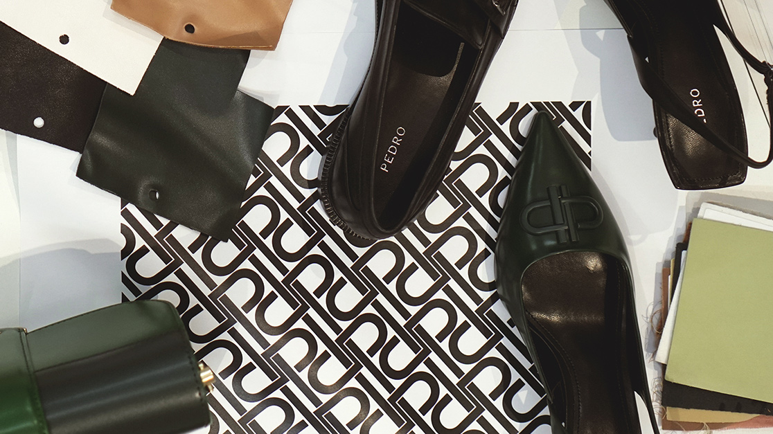
TÊTE-À-TÊTE
An Eye for Details
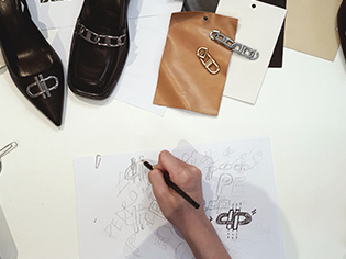
We caught up with Li Jing, the designer with punctilious charms and the one who gave PEDRO, the indelible brand symbol in PEDRO ICON collections. Watch the video and read on to find out more about who she is as she shares the story behind the creation of the brand’s latest style element.
BY JINGYI GOH, 25 OCTOBER 2021
Indeed, this brand symbol holds emotional value, one that is deeply rooted in the evolution of the brand and what it ultimately stands for. In addition, it was important for the brand to have its people involved in the fruition of this symbol. So much so, that it ran an internal competition amongst its designers and creatives to see who could create the best representation of this new design element.
Spoiler alert, it was Li Jing who bagged the winning design - a milestone not just for the brand but for the young designer as well. With the initial “P” of PEDRO as the key consideration, the symbol design revolves around PEDRO’s brand values.
“ When designing PEDRO ICON, I thought a lot about how this symbol can make us feel a strong sense of connection. Something close to our hearts. ”
“ When designing PEDRO ICON, I thought a lot about how this symbol can make us feel a strong sense of connection. Something close to our hearts. ”
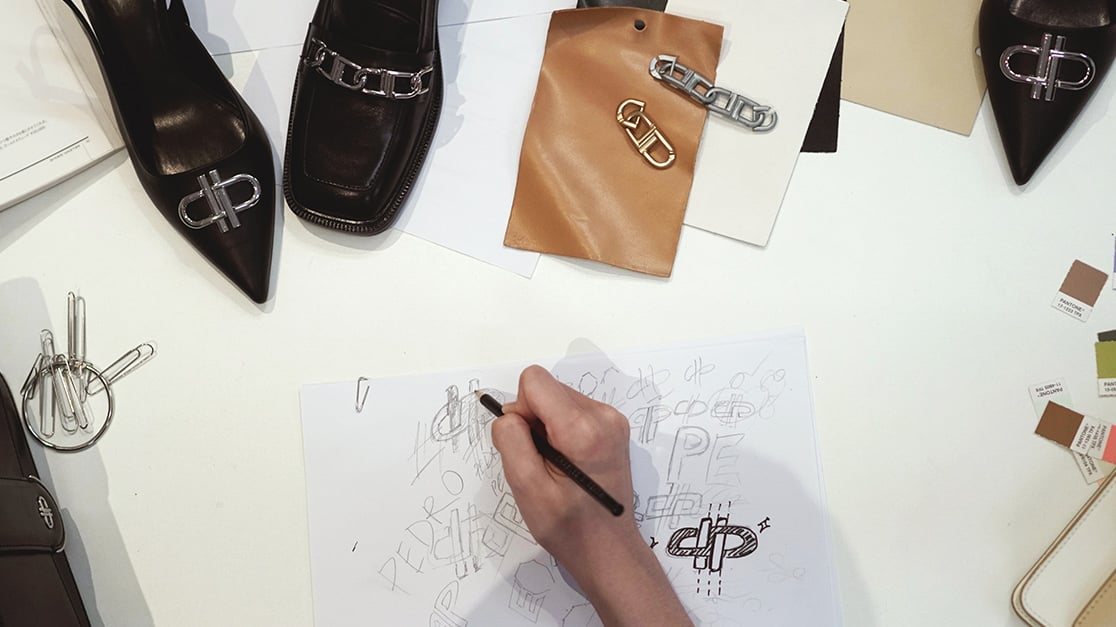
The symmetrical design of the symbol suggests balance, highlighting one of the brand pillars, Equality. The two parallel lines at the centre represents the people, constantly evolving in tandem, and along with the ever-changing world.
Finally yet importantly, the spirit of the brand that embraces infinite possibilities is interpreted through the infinity symbol within the icon.
The Designer – Li Jing
When asked about which part of the design process she enjoys the most, Li Jing’s answer unveiled the significance of what teamwork and people means to her. She opened up that she takes pleasure in the moments where designers put heads together to share a diverse range of design inspirations and colourful ideas.
When asked about which part of the design process she enjoys the most, Li Jing’s answer unveiled the significance of what teamwork and people means to her. She opened up that she takes pleasure in the moments where designers put heads together to share a diverse range of design inspirations and colourful ideas.
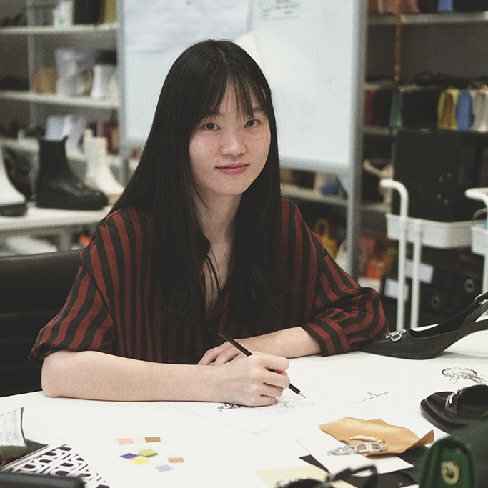
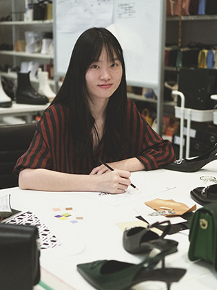
Li jing, Senior Design Assistant, PEDRO
Personally, one of Li Jing’s personal favourite fashion brands, is Dior. She views designs from Dior as pieces of art, sharing how she has a deep admiration for the eponymous fashion house’s level of work.
This ‘admiration’, we suppose, has impacted her work, given her dedication towards creating the brand symbol. It is then, a little wonder how the PEDRO ICON is curated with overflowing sense of sophistication and elaborated features embodied in one.
This is just the beginning of PEDRO ICON, the designer is optimistic and certainly has expectations on how the brand element can be well recognised in the near future and serve as a building brick to bring the brand to greater heights. Stay tuned as the brand slowly reveals the next chapter of its story with PEDRO ICON.
Read Further

EDITORIAL
The Duo
Encompassing dual identities of both feminine and masculine, to be worn with wit and confidence. Sharing the same bold attitude and effortless style, couple Hanna Chan and Takuro Hama Cheung are highlighted in the latest unisex Altura sneakers with the premise of a shared silhouette made for all.
Read More
EDITORIAL
Project Party
Paying homage to the evolution of partying, late-night agendas and modern sensibilities intertwine with a newfound sense of sophistication and grace. Evoking a desire from the deep, the PEDRO party collection redefines celebration by casting aside the superfluous in favour of a streamlined elegance that speaks volumes.
Read More
EDITORIAL
Explore The Uncharted
As seasons shift, let changes awaken the spirit of discovery within. This Spring, celebrate new beginnings and the joy of exploration against breathtaking landscapes rich in natural beauty, setting the stage for an aspirational journey into the unknown.
Read More
TÊTE-À-TÊTE
Celebrating Lunar New Year with Artistic Flair: PEDRO’s Collaboration with Designer Pei Li
In a captivating fusion of fashion and art, PEDRO has unveiled its 2024 Lunar New Year visual merchandising (VM) display. This year’s display is a result of an exciting collaboration with renowned designer Pei Li, who is celebrated for her unique blend of creativity and passion in the world of art.
Read More
EDITORIAL
Love Bound
Unbounded, captivating, and larger than life. Live out fantasies of love in all its extraordinary forms with PEDRO this Valentine’s Day. Departing from the conventional, watch as the collection, adorned with retro 8-bit motifs and digitally enhanced, tower over real-world environments to create a whimsical graphic experience. Symbolic of life in parallel worlds, discover a new joy to be found in a mixed reality filled with pixelated hearts - all reimagined with the romantic in mind.
Read More
EDITORIAL
Celebrating Traditions Sneakers
As the Lunar New Year approaches, PEDRO proudly announces the launch of an exclusive collection celebrating the arrival of the Year of the Dragon. In a culmination of artistry amidst tradition, embrace the essence of renewal and prosperity, and reimagine the celebration of heritage through a youthful take.
Read More
EDITORIAL
Sole Structures: Arc Sneakers
Step into a fusion of ancient allure and modern sophistication with the Arc Sneakers. Inspired by medieval aesthetics and designed for today, the sneaker draws inspiration from architecture of classical antiquity to reflect the grandeur of iconic landmarks like the Colosseum, seamlessly blending historical opulence with contemporary style.
Read More
EDITORIAL
A Woman's Story
Presented through portraits captured around the city of Shanghai, PEDRO returns elegance and sophistication to the everyday with a message of resilience and optimism, channeling the innate grit and strength in every woman. Discover the traits of a newly imagined muse: one who is sophisticated, self-assured, and successful on her own merit.
Read More
EDITORIAL
Hybrix
Emerging as a statement for the unbound and untamed, the latest remix of the HYBRIX sets the tone for the future with unbridled boldness and vigor. The ethos is simple: to reflect the multiple facets of a progressive aesthetic and the distinct characteristics of those who wear it.
Read MoreEDITORIAL
Icons illuminate
Building upon the ethos of embracing the differences that make us unique while empowering individuality, PEDRO Icon provokes fresh conversations on what it means to be distinctive. Introducing a two-part event to commemorate its third year, no expenses were spared as celebrations rang high and imaginations ignited.
Read More
EDITORIAL
Eclipsing Time
In a world ever in flux, the essence of time unfolds in multifaceted dimensions as enigmatic actress Shin Yubin joins the PEDRO Icon line as the face of Cambodia, encapsulating the unique allure and spirit of the collection. The latest Cambodia-exclusive collection embarks on a captivating journey, featuring Yubin traversing from sunrise to sunset through a mesmerizing kaleidoscope of moments that define our days.
Read MoreEDITORIAL
Hypnotic Icon
A new chapter begins with an enchanting display – as PEDRO Icon undergoes a bejewelled transformation for an awe-inspiring touch to essential pieces. Ephemeral and alluring, radiate and illuminate the night, much like the audacious yet enigmatic PEDRO protagonist, forever shimmering with glamour.
Read More
EDITORIAL
The Soirée
The time for celebrations has arrived, and there’s a tangible buzz anticipating the onset of the festive season. Set against the backdrop of a historical grandness within the walls of the Saigon Opera House, a story of inspiration and sophistication unfolds with the PEDRO Winter 2023 Party Collection, elevating the party aesthetic to new heights by adding a sense of savoir-faire to it.
Read More
EDITORIAL
A Cozy Chic World
As boundaries between home and work become increasingly fluid, finding solace in the familiar and cozy becomes paramount. Dialing into the mood of the moment and reflecting the spirit of dressing for comfort, multi-faceted creative Jessica Wu sheds her summer skin and gravitates towards relaxed chic pieces in the PEDRO Winter 2023 collection.
Read More
EDITORIAL
re:surface
To represent a new era, a revitalised Stitch symbol takes center stage, tying together the elemental pillars of Air, Earth, and Sea, and creating a captivating lore that weaves a cohesive narrartive.
Read MoreEDITORIAL
Icons Up Close
Inspired by daily living, the PEDRO ICON Winter 2023 collection offers a confident and intimate range of effortless essentials, getting up close and personal with icons in everyday environments. Proving that transformative elements elevate mundane situations and turn ordinary moments into extraordinary experiences, redefining how we perceive style in our day-to-day lives.
Read More
EDITORIAL
A Resilient Connection
In a heartfelt homage to the unbreakable bond of familial kinship, PEDRO delves into the enchanting world of twins. With an emphasis on the unparalleled connection shared by these duos, we explore the profound ties formed through a lifetime of shared experiences.
Read More
EDITORIAL
The Geometric Code
Channelling the power of design language, where bold shapes and modern construction converge to define a new era of style, PEDRO taps into visual play through constructed views. A play with proportions, wardrobe staples take on graphic dimensions for a visually captivating response to the needs of contemporary life.
Read More
EDITORIAL
A Traveller's Essentials
A wardrobe fit for an adventure - with travel at the heart of the collection. Seamlessly weaving together the essence of transit dressing interspersed with commuter-friendly essentials, PEDRO engineers an adaptive wardrobe catering to the practical and aesthetic needs of those who gravitate towards the uncharted.
Read More
EDITORIAL
The Living Art
Further exploring an individualistic spirit that drives its aesthetic output, PEDRO presents the Living Art; a metaphorical reflection on individuality, personality and character lensed once again by Clark Franklyn. Highlight pieces of the collection are incorporated into unique styles, reinforcing the notion that sometimes, contradictions can create cohesion.
Read More
PEDRO NEWS
PEDRO x Lovage: Hybrix Crossover
In the heart of Singapore, creativity and imagination took center stage at the PEDRO x Lovage: Hybrix Crossover event. Gathered for an intimate one-of-a-kind workshop, influencers and tastemakers indulged in the art of personalizing the coveted Hybrix sneakers, contributing artworks as graphics in their characteristic style.
Read More
EDITORIAL
A Mono Print
Reflecting new horizons and showcasing different perspectives, PEDRO features the Mono iconography on a collage of prints, where an innovative reinterpretation of a distinct aesthetic is revealed. The very signature of going against the grain, celebrate the splendour of simplicity through a collection of sneakers in a magazine layout that serves as a canvas for creation.
Read More
EDITORIAL
A Neutral Fluidity
Venturing beyond prevailing conventional codes, the static of contemporary life composes a range of characteristic non-binary looks that form PEDRO’s Fall 2023 unisex collection. Highlighting elevated essentials for all, the brand continues to uplift and inspire its community through an exploration of ideals through an alternative gaze.
Read More
EDITORIAL
An Imprint of the Future
Embodying the ethos of adapting to changing times, HYBRIX leaves an imprint of the future. Animated in three-dimension to emphasize technology and progress, modernistic elements showcased throughout serve as a reflection of a utopian future where imagination knows no bounds.
Read More
PEDRO NEWS
Exciting New Editions
Showcasing a series of creative communions where extraordinary vibes flourish in diverse environments, PEDRO’s international endeavours propel the brand’s regional markets into the spotlight. Seamlessly incorporating elements of the brand into each unique concept, relive each event through the intersection of art and performance, captivating audiences and creating unforgettable moments.
Read More
EDITORIAL
HoundStooth With A Twist
Experimenting with classics, PEDRO Studio devises the Fall 2023 collection as an unfamiliar take on familiar elements. Breathing new life into established aesthetics with this season’s highlight - the houndstooth motif, sculptural forms speak to the past and future, a central point of reference for the collection’s recontextualization of traditional design codes.
Read More
EDITORIAL
Into The Waves
Inspired by the sea and the vibrant culture that surrounds it, PEDRO blends crystalline ocean waves with contemporary aesthetics for a comprehensive range of summer staples to elevate your warm-weather style. The collection flows in a dialogue of colour and textural layers interspersed with oases of simplicity and contemporary elegance.
Read MoreEDITORIAL
The Blueprint of an Icon
In its 3rd year, the latest iteration of PEDRO Icon continues its stylistic evolution, expanding its creative horizons while staying true to the distinctive aesthetics of the collection.
Read MoreTÊTE-À-TÊTE
Intimate and Uninhibited
Talent can be found in every corner of the world, as PEDRO shifts the gaze from art to the artists by catching up with creatives Lily Taieb and Alfie Nickerson, whose work reflects a time when individuality is more important than ever. We speak with them about their projects, sources of inspiration and motivation, and how they establish a characteristic aesthetic that is faithful to their personal style and vision of life.
Read More
EDITORIAL
Reflecting An Experience
Combining understated glamour with high-shine impact, PEDRO expresses complexity through subtle colours contrasted with metallic accents to give a surreal twist to classic shapes.
Read More
EDITORIAL
In Perpetual Motion
The embodiment of exciting times ahead. Commemorating an iconic silhouette, PEDRO ushers the Swift sneakers back in the fold, this time in an exciting range of vibrant hues to take any laid back look to the next level.
Read More
EDITORIAL
Postcards From The City
A powerful medium to evoke emotions, postcards offer a unique representation of the location, capturing its essence through visual imagery and conveying a sense of nostalgia and longing for the place. PEDRO provides a glimpse into the sights and sounds of Hong Kong, inspiring one to fall in love with the magic of a city.
Read More
EDITORIAL
The Pink Edit
Infusing the colour pink with a mesmerizing vibrancy that awakens the senses, PEDRO brings a kaleidoscopic collection pulsing with infinitely striking looks.
Read More
EDITORIAL
An Ode to Earth
An ode to nature, the campaign serves as an apt reminder of Mother Earth’s natural beauty and the bounty it provides from which inspiring pieces are manifested. This Summer’s rePEDRO campaign aims to highlight the purpose of the collection, one that fuses us between the product and the environment.
Read More
EDITORIAL
Colour Pop
Burst forth with vivid colours and bold designs. Be emboldened to unleash the full power of your unique personality through the irresistible charm of the Megan line, and highlights like chain detailing that imbuses the bag with a modern edge.
Read More
EDITORIAL
A Desert Hope
In a time of reflection, self-discovery and reconnection, PEDRO presents an exclusive collection that embodies a spiritual awakening. At the heart of this collection is an introspective adventure that materializes in the form of a captivating experience that culminates at sunset in the desert.
Read More
TÊTE-À-TÊTE
Art Through Her Eyes
For years, art has undoubtedly influenced our culture and society – in the way we think, feel and connect. This International Women’s Day, PEDRO celebrates women by spotlighting 3 aspiring female artists from South Korea - Kim Kijeong, Huh Suyon, and Jeon Hyunsu, who specialize in classic, contemporary and 3D art respectively, and have played a part in the evolution of art.
Read More
EDITORIAL
Hybrix
Introduce abstractions of an unpredictable future and get lost in luminous streets with the Hybrix, a contemporary collection based around the idea of movement around ever-changing terrains.
Read More
CAMPAIGN
Natural Touch
Slide into a state of relaxed refinement with an indulgence in tactile sensation and a decidedly muted palette, shaped by fluid silhouettes for a contemporary aesthetic.
Read More
EDITORIAL
San Valentin
Representing the beautifully warm things in life, infuse some romance into your ensembles this Valentine’s Day with a selection of contemporary accessories that embrace love in all forms. Enjoy the excitement of possibilities with creations shaped by love, designed to win your affection and make your heart take flight.
Read MoreEDITORIAL
Tangible Pixels
Enter a surreal and pixelated world where anything is possible and nothing is as it seems with the PIXEL, PEDRO Studio’s key textural element for the future. Form and function are translated into pieces of timeless construction with enough contemporaneity to fit into the wardrobe of today's world, creating the perfect balance of modern and sophisticated appeal.
Read MoreEDITORIAL
Phygital Transference
PEDRO enters an environment where both physical and digital worlds meet with the Spring 2023 Collection, creating pieces that capture the uncertainty of the virtual universe we live in: the magic of endless possibilities.
Read More
EDITORIAL
Painting Festive Landscapes
PEDRO explores the themes and symbolism behind colours this Lunar New Year, documenting how they can feel so intimate and familiar yet transcendent. Harnessing the power of colour, a controlled palette combines and contrasts with visuals created to bring out the social meanings attached to each colour, preserving intangible moments and expressing the essence of fond memories.
Read More
EDITORIAL
Lunar New Year Reframed
Digital and physical mediums come together in pieces that evoke PEDRO’s most characteristic codes this Lunar New Year. Reinterpreting classic designs with modern icons, let the charming aesthetics and cosy tones provide the perfect finishing touch to your festive attire.
Read More
EDITORIAL
Christmas Story
Be free from formal constraints and reveal your inner personalities this holiday season. We all have our personal stories to tell.
Read More
EDITORIAL
Tough As Nails
Make an assertive entrance to the scene and personify your inner tempest through rugged, military-like silhouettes and innovative designs mixed with urban elements.
Read More
EDITORIAL
Earthy Touch
The natural evolution to the way of living, rePEDRO rethinks functional dressing through eco-conscious everyday essentials rendered in the public interest. From design to conception, our innovations are created in symbiosis with green philosophies and recyclable materials, empowering visionary individuals who share with us the desire to change the world.
Read More
EDITORIAL
Altitude
Reflecting on tomorrow’s society, PEDRO rethinks modern living. Take-off with the Altitude, boasting a lightweight construction and defined by understated functionality, start each day with a step steeped in comfort and distinction.
Read More
PEDRO NEWS
RCS Event
PEDRO made its physical return with its first physical event since the pandemic in style, celebrating its latest store opening at Raffles City Singapore, and marking the date with the introduction of a revamped logo and collection.
Read More
EDITORIAL
Like nobody's watching
With materializing a coherent, free and captivating aesthetic as the premise, PEDRO unveils a curation of pieces to welcome the coldest season.
Read More
EDITORIAL
Ladylike Pieces
Engineered by exploring and taking in nostalgic references, heritage is translated through soft colours and gentle curves, and reinterpreted to form the uniform of the decorous woman in their prime.
Read More
EDITORIAL
The KATE Bag
Made for all the stylish women in charge, the KATE bag is the perfect bag that will take you from day to night with ease.
Read More
EDITORIAL
How To Style Guide For Colder Months
Escape monotony and conjure an aesthetic that breathes new life to your ensembles, featuring timeless essentials and laid-back styles to complement a range of minimalist cold-weather looks.
Read More
EDITORIAL
Chromatic Comforts
Hues that conform a warm feeling and construction that allows the appreciation of every detail.
Read More
EDITORIAL
Covet The Dessau Bag
A symbiosis of disparate elements to meet the needs of women who value style and individuality. The Dessau Bag is a harmonious union of hard lines and gentle curves, forming the foundation of a unique look that is yours alone to create.
Read More
EDITORIAL
Journey to EOS
Following its addition to PEDRO’s Signature Sneakers line in Spring 2022, The EOS Series is back with a new iteration. The Fall 2022 EOS sneaker introduces a fresh take with the upper highlighting a more dynamic detail with a barcode to represent a unique identity.
Read More
EDITORIAL
Look Bold This Fall
Rejuvenate the wardrobe and make an effortless transition into fall through innovative cuts and bold construction. PEDRO brings a new and electric feeling, as we oscillate from summer and stand on the cusp of something special.
Read More
EDITORIAL
Fur, Felt And Braided Details
The personal and the universal intersect through PEDRO’s curated list of textured products – the sleek design and the tactile richness of the material. Clean lines and deft styling make you stare, but it is the texture that makes you feel.
Read More
EDITORIAL
Nylon Edit
In a world eager for escape and evasion from harsh reality, PEDRO bets on elevating and honouring the everyday through the use of nylon, tapping in to the material’s inherent durability and strength.
Read More
EDITORIAL
Luscious Colours To Covet This Fall
Pedro sets the tone this Fall with a dynamic range of products featuring crazy vibrancy and bold colours composed to create aesthetically pleasing results. Extravagance that works in perfect harmony for a full-spectrum aesthetic experience.
Read More
EDITORIAL
Spur Sneakers
Standing still is not an option with the Spur Sneakers. Featured in a chromatic palette of colours, the new silhouette from PEDRO embodies continuous motion and the pursuit of novel experiences, making this the new essential to any wardrobe.
Read More
CAMPAIGN
Fall '22: In The Space Between
PEDRO Fall 2022 collection focuses on the study of the space between light and shadows. Shot entirely on film to capture the its raw essence, the collection is also infused with the play of translucency.
Read More
PEDRO CARES
Cheers To Brighter Days Ahead
PEDRO and Yellow Mushmellow team up to release a limited-edition vacuum flask featuring bright colours and positive affirmations to encourage people to take time for themselves - in a bid to raise awareness on mental health and encourage good ol' self-loving.
Read More
EDITORIAL
Uncomplicated Staples
In continuation of the last PEDRO Studio launch in Summer, the Fall 2022 collection speaks to the inner rebel of the modern day Don Quixote with its latest range of genuine leather products.
Read More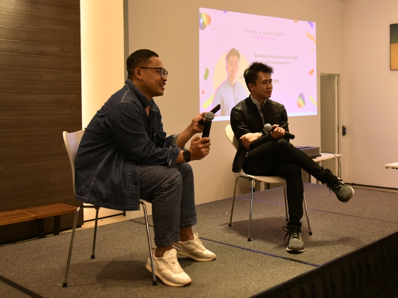
PEDRO CARES
Pride And Prosecco
In celebration of Pride Month, PEDRO hosted Clement Tan, an LGBTQ+ advocate, at our Headquarters to share with us on the topic of working towards an inclusive and safe working environment for everyone.
Read More
TÊTE-À-TÊTE
In Conversation With Our Creatives
We caught up with some of PEDRO’s in-house creatives to find out more about them, their interests and what drives their creativity. Read on to find out more about Chloe, Livia and Clara.
Read More
EDITORIAL
Color Up Your Life
If life is like a box of chocolates, and you do not know what you’re gonna get, make ours filled with one of this Uber-chic, round mini sling bags instead. Featuring four different “flavours”, each bag represents a unique personality but in all, exude sophisticated, girly charm.
Read More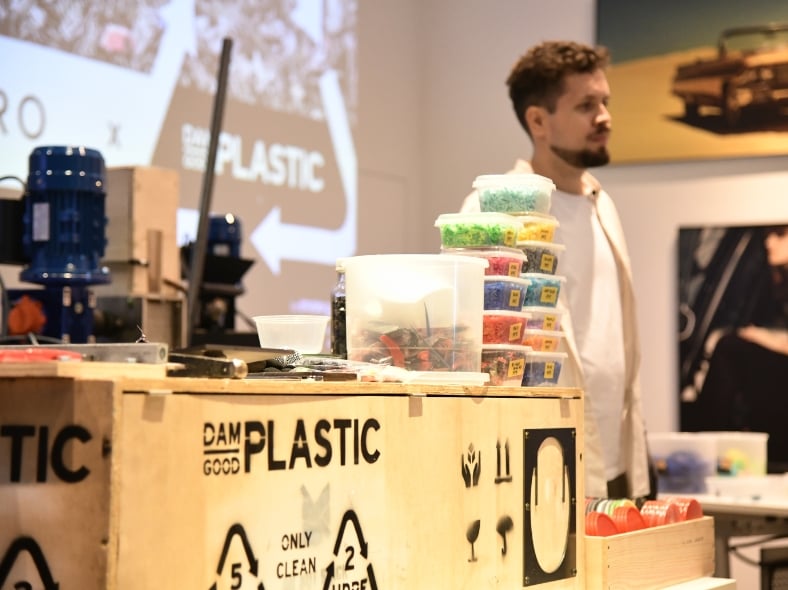
PEDRO CARES
DAM Good Effort
As part of PEDRO’s commitment towards becoming a better brand for the environment, we have invited Matthijs Rikken from DAM Good Plastic to our Headquarters to give our colleagues in Singapore and overseas a talk on how as a community, we can do better with plastic waste and upcycling. We caught up with Matthijs before his talk, to learn more about who they are and why they do, what they do.
Read More
EDITORIAL
Summer Soiree
On 18 June 2022, PEDRO played host to influencers and guests at its flagship store in T-One Mall, Phnom Penh, Cambodia. Attended by the who’s who in fashion, guests were treated to a Summer Styling workshop that featured key collection products such as pieces from Summer Selections, Summer ICON range and the Signature Rift Bag. Read more below.
Read More
EDITORIAL
Quick Kicks
Cop these Quick Kicks now – a new EFFORTLESS ESSENTIALS from PEDRO. A must-have this season, this number is a harmonious juxtaposition of trendy sneaker elements that have been cleverly manifested into a cohesive, sophisticated footwear.
Read More
EDITORIAL
Soft Touch
Take flight in these comfort-driven and fuss free, plush, quilted effortless essentials. Suitably stylish as well, these lightweight-inspired designs combines comfort with runway fashion sensibilities. Comfortable to touch, effortless when worn, covet one of these dynamic pieces now.
Read More
EDITORIAL
The Unisex Collection
Effortless Essentials that is truly meant for everyone. Like this range of summer perfect pouches and sling bags, we have created designs that can effortlessly fit any style, regardless masculine or feminine. The versatility game is definitely strong in this range, so you can covet them, no matter what your personal style is.
Read More
EDITORIAL
Wander's Summit
A combination of summer adventure and sheer sophistication that is truly meant for the woman on the go.
Read More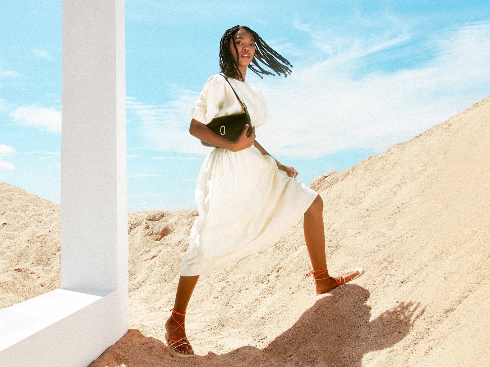
EDITORIAL
The Rift Bag
Inspired by the nature’s majestic landscape and peaks, the Rift Bag has a classic baguette shape for everyday use. Featuring the orange colour Rift bag as the hero piece, this genuine leather bag also comes in this season’s trendiest shades of mint, classic black, and white.
Read More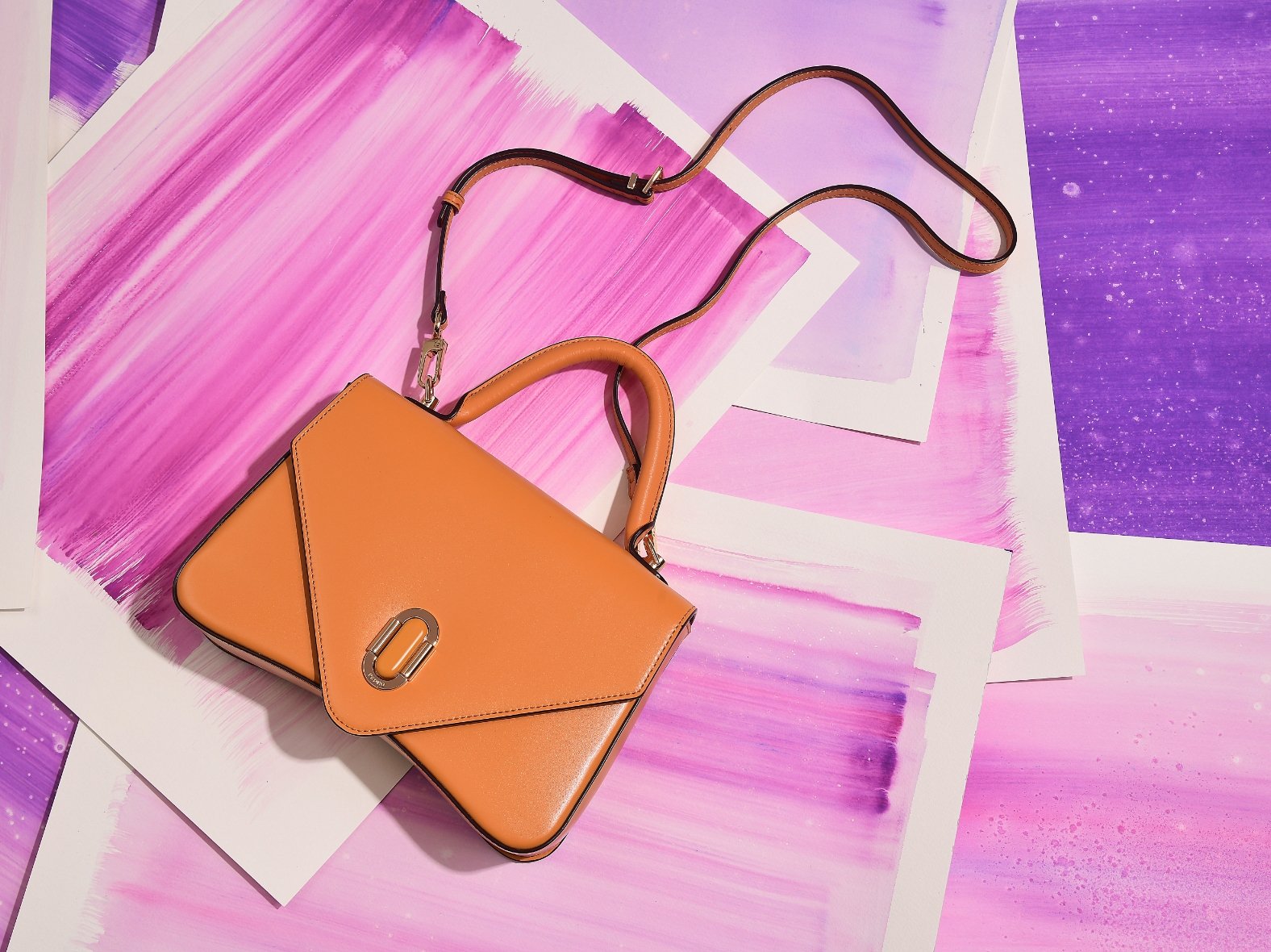
EDITORIAL
The Zenith Bag
The pinnacle of style is here. Presenting the Zenith Bag – the sophisticated, fashion essential that epitomizes feminine grace in a bag. Featuring a unique silhouette that is marked by an inverted triangle, the Zenith Bag was called so as a nod of strength and success.
Read MoreEDITORIAL
PEDRO Icon: An Iconic Moment
This summer, PEDRO celebrates icons in the arts and entertainment industry by inviting Shye-Anne Brown and Alexander Yue to be the face of the PEDRO Icon Summer 2022 Collection. Themed ‘An Iconic Moment’, this campaign aims to highlight the definitive moment where one decides to break free from the mould and truly embrace their individuality.
Read More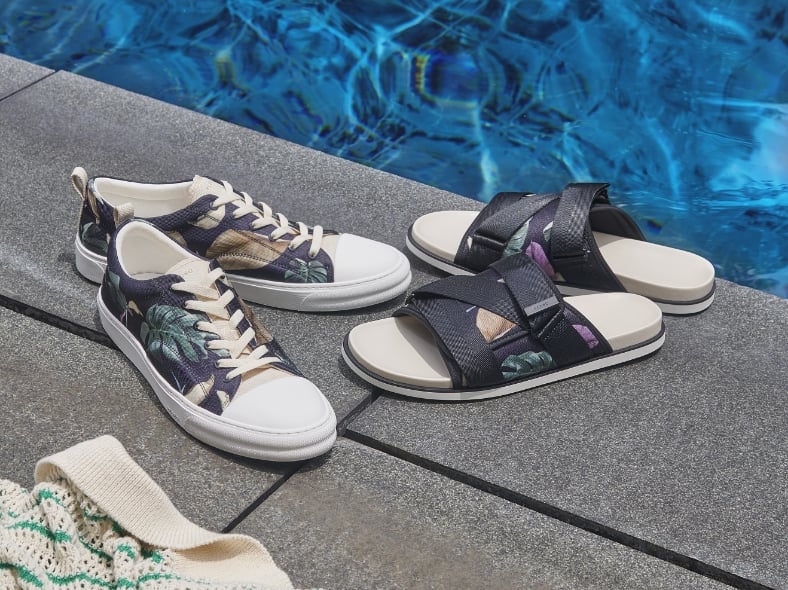
EDITORIAL
The Palm Series
Welcome a new sense of style this summer with the latest ‘Palm Series’ that is glamourous and fun. Inspired by palm leaves, a conspicuous symbol of summer, this series is made for your luxurious summer getaways. Discover this collection of fashion essentials that will elevate your casual summer look.
Read More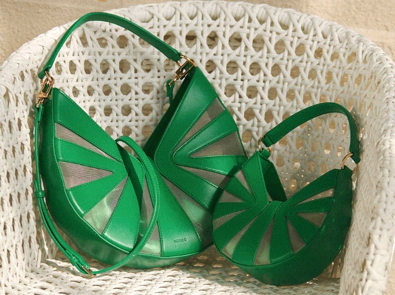
EDITORIAL
The Riata Bag
Flirty, fun yet sophisticated, the Riata Bag is a must-have fashion essential this summer for every style-conscious lady. The ideal accessory to pack for a summer sojourn, the Riata tantalizes with a unique rope design that has been beautifully juxtaposed with a mesh detail for that peek-a-boo effect.
Read More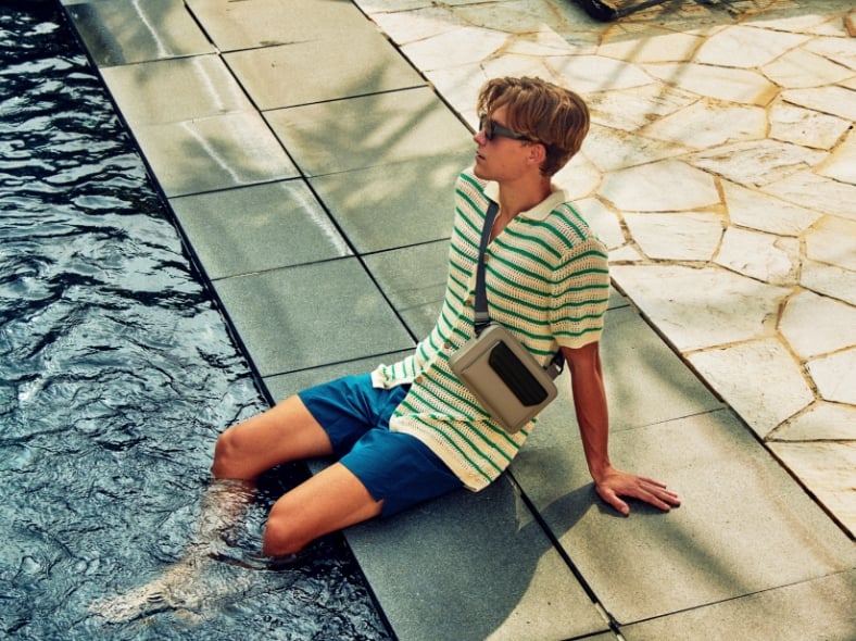
EDITORIAL
Summer Retreat
This fresh range of sandals and sling bags for men offers a touch of class and sophistication to the wearer this summer. Make these pairing the fashionable essentials you will need this season.
Read More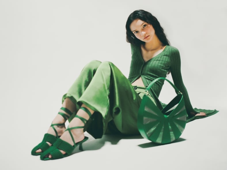
CAMPAIGN
Campaign Commentaries
Look forward to a vibrant season with new and exciting fashion essentials from PEDRO. A laid-back, resort-ready yet chic collection to elevate fun and joyful ensembles. Have an insider’s look at our gallery of film photographs highlighting the Summer 2022 Selections.
Read More
EDITORIAL
Summer Selections
This season, PEDRO launches the Summer 2022 campaign that features vibrant effortless essentials that will arm the modern men and women with a new style confidence.
Read More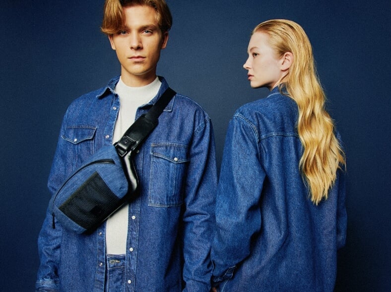
EDITORIAL
Effortlessly Denim
Raw, simple and uncomplicated, ‘Effortlessly Denim’ highlights the understated fabric that has become an iconic staple in everyone’s wardrobe. Discover the essential denim collection to elevate your style this summer effortlessly.
Read More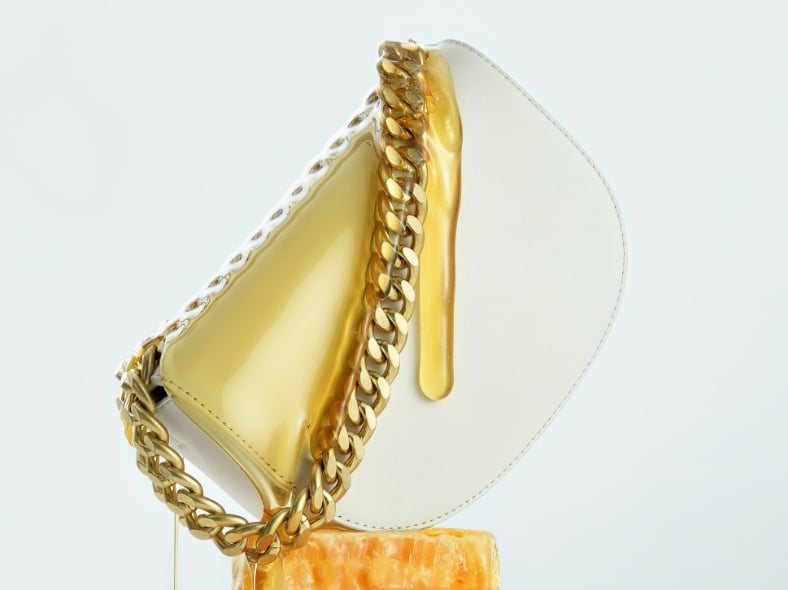
EDITORIAL
The Taylor Bag
Powering style confidence with PEDROSTUDIO, the new TAYLOR bag is created for the discerning woman who deserves the best. An effortless style essential that is luxurious and sophisticated, this bag is designed for the discerning, empowered woman who knows what she wants.
Read More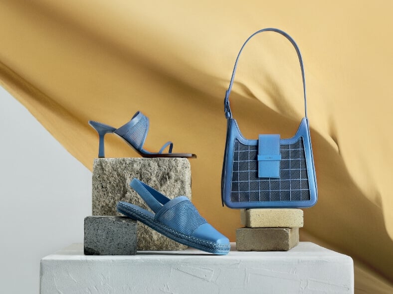
EDITORIAL
A Blue Summer
Featuring a series of products in blue, ‘A Blue Summer’ is inspired by the flow of life in summer. This collection encapsulates the essence of summer with blue and yellow hues that eludes the idea of a comforting sunset in a warm summer. Discover this collection for a tasteful casual summer look.
Read More
EDITORIAL
Women Can Do It Too
This International Women’s Day, PEDRO spotlights five aspiring women from various industries to celebrate their honorable achievements and share their stories to inspire and empower many more. Dressed in multiple shades of pink, the ladies redefined the soft and delicate assumed colour with a touch of their vivid character and shined with confidence, elegant yet powerful.
Read More
STYLING
Step Into Spring
Spring is upon us. What better way to carry on your trans-seasonal wardrobe than with some fashion forward accessories in this season’s must have colors. Get updated with styling tips from the latest runway approved colors.
Read More
EDITORIAL
Pushing Boundaries
A special collaboration between LASALLE College of the Arts and PEDRO, has final year students from the Diploma in Creative Direction for Fashion - Joseph Poh, Zuaipy Fariqa Santiago, Wang Shi Wen and Wang Lei, producing a set of dynamic visual assets that relooks at the EOS campaign from a different perspective.
Read More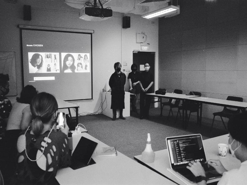
EDITORIAL
LASALLE Partnership
At PEDRO, we believe in being the voice for the new generation. This season, PEDRO partners with Diploma in Creative Direction for Fashion from LASALLE College of the Arts to create special creative content for new signature sneaker, EOS.
Read More
EDITORIAL
PEDRO Studio
PEDROSTUDIO is a collection that sits differently from the main PEDRO women line, where special emphasis and attention is placed on its details and design.
Read More
EDITORIAL
EOS SERIES SPRING 2022
Drawing inspiration from the Greek Goddess of Dawn, a representation of new beginnings and a symbol of optimism, PEDRO unveils our brand new 2022 signature sneakers, The EOS Series. The latest addition to PEDRO’s Signature Sneakers line is a depiction of effortless with a twist. This series is a dialogue around the hope and optimism of our ever-changing environments, embodying our energized spirits and boldness to seize the day and take on any challenge effortlessly.
Read More
TÊTE-À-TÊTE
Couple Goals
PEDRO catches up with Nic Liew and Douglas Tan, models and real-life couple, who fronted PEDRO Valentine’s Day Capsule Campaign. Read on to find out more about how their love blooms, on and off set.
Read More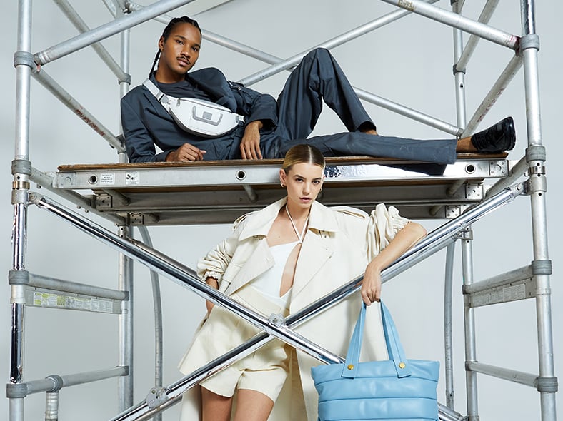
CAMPAIGN
Manoeuvre To Live Anew
This Spring, PEDRO further embraces the joy in accessorizing with our Spring 2022 collection showcasing key current highlights for PEDRO Women and PEDRO Men. Entitled Manoeuvre to Live Anew, this campaign is an abstract exploration of renewed hope. Discover the essential fashion accoutrements to elevate your style, effortlessly.
Read More
EDITORIAL
Love Blooms
This February, PEDRO celebrates Valentine’s Day with our Love Blooms capsule that interprets subtle modern romance and the preservation of love. Spend this V-Day with your loved ones in style with the latest Love Blooms capsule from PEDRO, designed for the modern and effortless women and men. The unisex appeal in this collection is what makes it outstanding and can be easily styled into any outfit, making it an ideal gift of love for any important being, proving that love is indeed unconditional.
Read More
EDITORIAL
Stripes And Blooms
PEDRO collaborates with Shanghai-based illustrator Jude Chan this Lunar New Year on an extra special product that is exclusively available in China. Read on to discover more.
Read More
EDITORIAL
The Art of Prosperity
This Lunar New Year, PEDRO adds a dose of style and sophistication to its special Year of Tigervcapsule collection. A juxtaposition of modern trend sensibilities with traditional artistic values, this collection pays homage to the majestic Tiger with pieces for men and women. Discover below, Effortless Essentials to complement your celebratory looks this spring.
Read More
EDITORIAL
PEDRO Studio
When it comes to looking great, we mean business. Start your year right while maintaining that luminous glow with these timeless yet updated leather fashion essentials. Scroll down to uncover the right key accessories to elevate your power look.
Read More
INTERVIEW
Style Savant
Meet Echeru, PEDRO Singapore’s first style advisor and your personal fashion steward to getting you look effortlessly stylish.
Read More
STYLING
Why Is Fashion Label PEDRO So Worth Getting?
PEDRO is an effortless fashion essential brand, focusing on exclusive designs. No more suffering from outfit clashes!
Read More
EDITORIAL
Gentle Flows
An ode to the Earth, the rePEDRO Winter 22 Collection takes a soft yet impactful approach with its eco-conscious make and design. Made not only for the style-conscious, but for those who are looking for fashionable essentials that were concepted with a difference as well. Discover more below.
Read More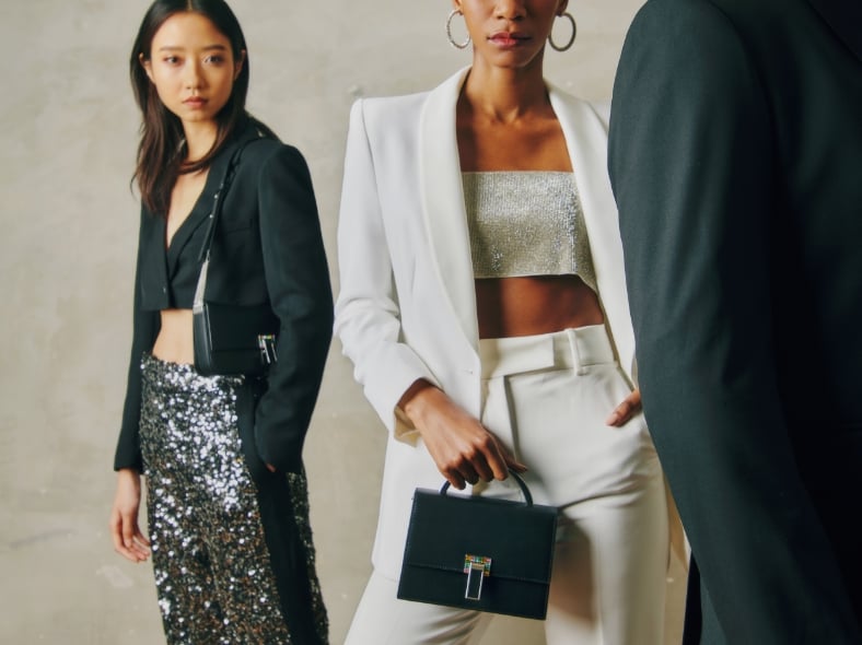
EDITORIAL
'Tis The Season
Ready to party? This festive season we are putting on our dancing shoes and celebrating with our loved ones for a Holiday to remember. Add a little sparkle (figuratively and literally!) and jazz up your look, however small or big the party. We hope you find these little gems to add a touch of sparkle for your warm and intimate moments full of surprises, joy and laughter.
Read More
EDITORIAL
Razzle Dazzle
This festive season, party in style with all that PEDRO has to offer. Whether it is an intimate dressy night in to usher in the festivities or a sophisticated daytime celebration with family and friends, there is definitely something for everyone. This festive season, regardless the crowd size, you have every right to party while looking fabulous with our newest range of shoes and bags. Glamorous and glittery, dressing up just got way more effortless.
Read More
EDITORIAL
The Tectonic Series
Inspired by topography landscaping, a study on shapes and features of land surfaces, we infuse the contour and layering lines that forms the essence of the outsole. The PEDRO TECTONIC series returns and is a conversation around architectural design and our ever-changing environment, that shifted our design perspective.
Read More
EDITORIAL
Small Gifts, Big Thoughts
It is never too early to start shopping for loved ones. From glamorous hedonists to fashion-forward homebodies, or even those with an acquired style, we have the ideal accessory gift for your favorite person.
Read More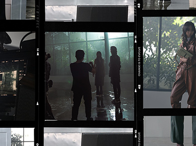
TÊTE-À-TÊTE
Style Tri-Factor
Choann, Kaigin and Dingwei - three dynamic individuals who PEDRO had the privilege to work with in our latest FW21 – Change is to Evolve. Read on to learn about what makes them live a little more.
Read More
TÊTE-À-TÊTE
An Eye for Details
We caught up with Li Jing, the designer with punctilious charms and the one who gave PEDRO, the indelible brand symbol in PEDRO Icon Collections.
Read More
TÊTE-À-TÊTE
Familiar Spaces, Scattered Sentiments
A first for him venturing away from collage and image making. This is the first photo series by local artist Dylan Chan in collaboration with PEDRO, showcasing their new winter products.
Read More